Grid
Background grid on the layout with functionality to click on the grid item
OnClick event props schema
| Property | Type |
|---|---|
since | string |
till | string |
date | string |
channelUuid | string |
onGridItemDrop event props schema
Only works if the grid is enabled and the external drag and drop library or custom solution is integrated
| Property | Type |
|---|---|
since | string |
till | string |
date | string |
channelUuid | string |
And other props pass to the dragged element
Properties returned from useEpg
| Property | Type | Description |
|---|---|---|
onGridItemClick | function() | Get converted item data after click on grid cell action |
getDropItemData | function() | Get converted item data after external drop into grid action |
onGridItemDragSelect | function() | Get converted item data after external drag select action |
Dragged item data attributes
Below are the attributes are specific to the dragged item data but you can add more attributes as per your requirement. Check the Code Example link
| Property | Type | Description |
|---|---|---|
title | string | Title |
description | string | Description |
duration | string | Duration of an element in minutes |
Example - On Grid Item Click
const { getEpgProps, getLayoutProps, getDropItemData } = useEpg({
channels,
epg,
startDate,
endDate,
grid: {
enabled: true,
onGridItemClick: (props: GridItemProps) => alert(JSON.stringify(props)),
// Add this function if you are integrating with the external drag and drop library e.g. react-dnd
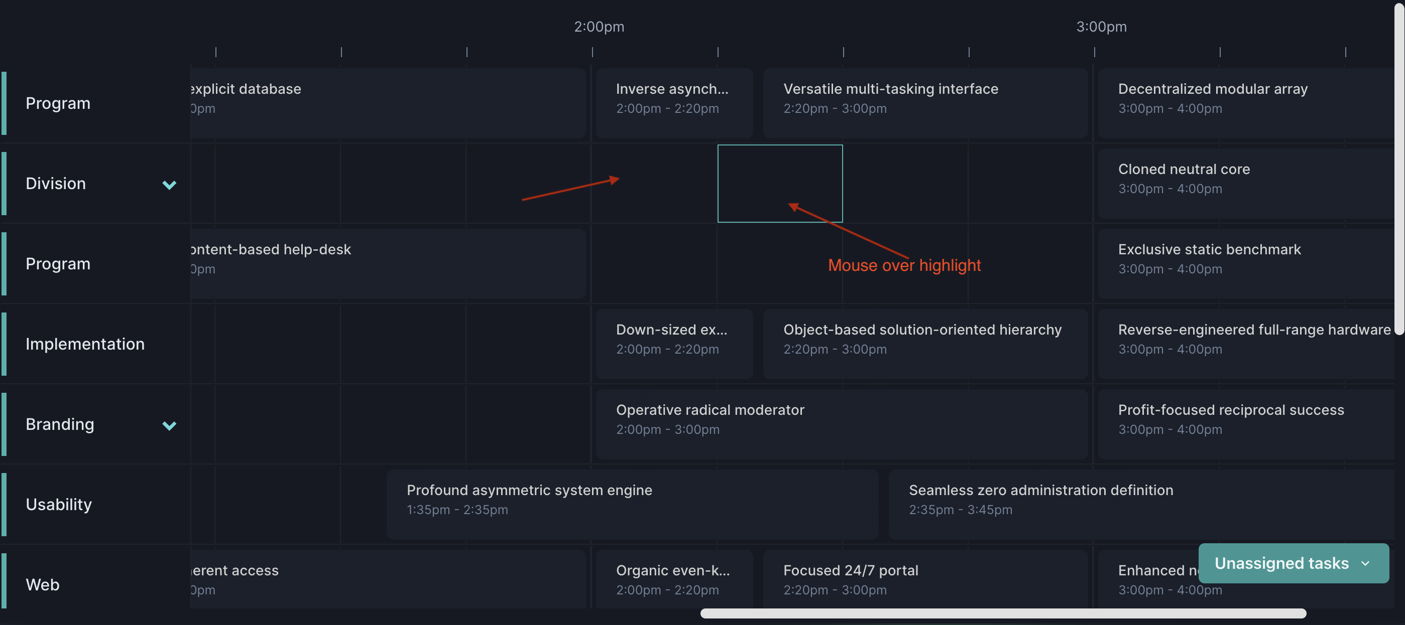
hoverHighlight: true,
},
...
});
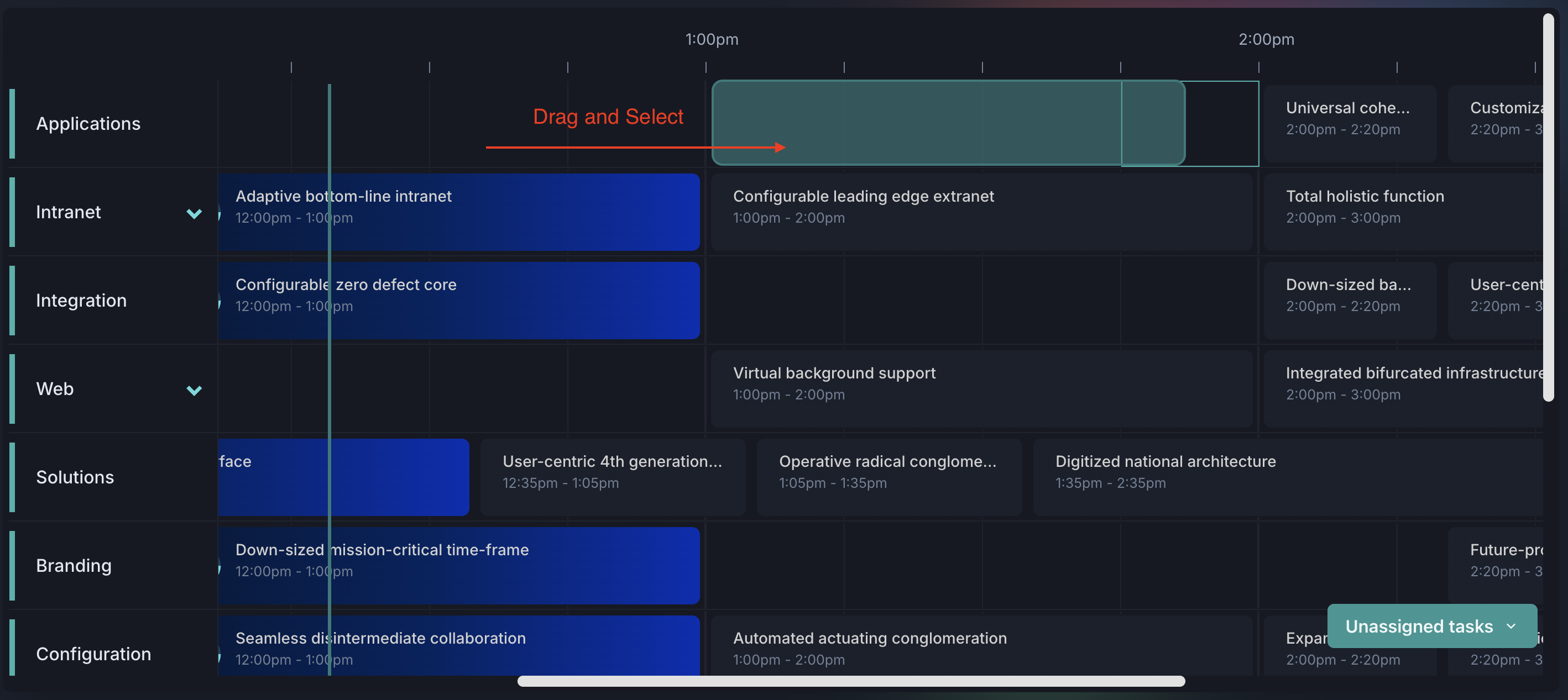
Example - Drag and Select
const { getEpgProps, getLayoutProps, getDropItemData } = useEpg({
  channels,
  epg,
  startDate,
  endDate,
  grid: {
    enabled: true,
    onGridItemClick: (props: GridItemProps) => alert(JSON.stringify(props)),
   onGridItemDragSelect: (props: GridDragItemSelectProps) =>
// props data:  {since: '2025-07-01T01:45:00', till: '2025-07-01T02:30:00', channelUuid: 'a5db6383-642e-4bc5-89fe-0641a02f5fb1'}
      alert(JSON.stringify(props)),
    hoverHighlight: true,
  },
  ...
});

// Grid Cell

import {
  GridDividerItemProps,
  GridCell,
  GridItem,
  GridDivider,
  useGridExternalDnD,
} from "../../components/src";


export function GridItemCell(props: GridCell) {
  const {
    isDayMode,
    isHoverHighlight,
    dropAreaRef,
    index,
    item,
    timelineDividerArray,
    gridDividerProps,
    gridItemClickProps,
    gridItemDnDProps,
  } = props;

  return (
    <GridItem
      ref={dropAreaRef}
      isDayMode={isDayMode}
      data-item={JSON.stringify({ item, index })} --- Add data-item attribute to identify the cell
      isHoverHighlight={isHoverHighlight as boolean}
      {...item.position}
      {...gridItemClickProps}
      {...gridItemDnDProps}
    >
      {isDayMode &&
        timelineDividerArray.map((_, index) => (
          <GridDividerItem
            key={index}
            index={index}
            item={item}
            dividerProps={gridDividerProps}
          />
        ))}
    </GridItem>
  );
}

function GridDividerItem({
  index,
  item,
  dividerProps,
}: GridDividerItemProps) {
  const { styles, props } = dividerProps;
  const { onItemClick, onItemDrop, ...restProps } = props;
  const { isDragOver, onDrop, onDragEnter, onDragLeave, dropAreaRef } =
    useGridExternalDnD({
      onItemDrop,
    });
  return (
    <GridDivider
      ref={dropAreaRef}
      key={index}
      {...styles}
      left={styles.left(index)}
      {...restProps}
      onClick={onItemClick(item, index)}
      // Drag
      isDragOver={isDragOver}
      onDragEnter={onDragEnter}
      onDragLeave={onDragLeave}
      onDrop={onDrop(item, index)}
    />
  );
}
Example - Drop Item Data
const { getEpgProps, getLayoutProps, getDropItemData } = useEpg({
  channels,
  epg,
  startDate,
  endDate,
  grid: {
    enabled: true,
    onGridItemClick: (props: GridItemProps) => alert(JSON.stringify(props)),
    // Add this function if you are integrating with the external drag and drop library e.g. react-dnd
    onGridItemDrop: (props: GridItemProps) => {
        const newElement = getDropItemData(props);
        // Add your logic here to handle the drop event
        // Only works if the grid is enabled and the external drag and drop library or custom solution is integrated
      },
    hoverHighlight: true,
  },
  ...
});

// Dragged element
<div
  id={id}
  onDragStart={(e) => e.dataTransfer.setData("text/plain", id)}
  data-title={title}
  data-description={description}
  // Example for mode: { type: "day" },
  data-duration={duration} // In minutes
  // Example for mode: { type: "week" }, one day
  // data-duration="1439" // In minutes
  // Example for mode: { type: "month" }, one month
  // data-duration="43170" // In minutes
  // More data-attributes can be added here
  >
    {title} - {duration} min (drag me)
</div>